Contact Us
Send Us a Message
Need expertise and innovation on your project? Our team can help.
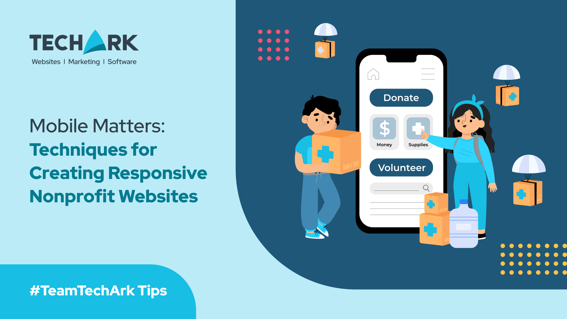
Think about the moments your nonprofit values most—when someone learns about your mission for the first time, feels inspired to give, or decides to volunteer. Now imagine this: a potential supporter hears about your organization and pulls out their phone to learn more or donate. But instead of connecting, they struggle with a site that’s hard to navigate. For nonprofits, these moments of friction aren’t just inconvenient—they can mean missed donations, lost volunteers, and opportunities that slip away.
In a world where over half of all nonprofit website traffic comes from mobile devices, having a responsive website isn’t just about technology—it’s about accessibility, trust, and ensuring your message reaches every supporter. A mobile-friendly website reflects the care and professionalism of your organization, ensuring that when someone chooses to engage, nothing stands in their way. This guide is designed to help nonprofits create websites that are not only functional but also amplify their mission and values at every touchpoint.
Table of Contents
Why Mobile Optimization is Critical for Nonprofits
Mobile Traffic Dominates the Digital Landscape
As stated previously, more than half of all nonprofit website traffic comes from mobile devices. As smartphones and tablets become primary tools for accessing the internet, nonprofits must meet users where they are. A mobile-friendly website ensures that your supporters can connect with your mission, whether they’re on a desktop or scrolling from their phones.
Driving Donor Engagement and Accessibility
A responsive website offers a seamless experience for donors and supporters, making it easy for them to navigate your site, read about your mission, and contribute financially. Features like mobile-friendly donation forms and accessible menus ensure visitors can support your cause easily. Additionally, responsive websites provide an inclusive experience for users with visual impairments or those relying on assistive technologies.
Boosting Search Engine Rankings
Google prioritizes mobile-responsive websites in search rankings, making it easier for potential supporters to find your organization online. A mobile-friendly site isn’t just a design upgrade—it’s an investment in your nonprofit’s visibility and long-term impact.
Best Practices for Creating Mobile-Responsive Nonprofit Websites
Adopt a Mobile-First Design Approach
Start with the smallest screens and work your way up. A mobile-first design approach ensures that your site functions perfectly on handheld devices, which is critical for nonprofit organizations aiming to capture mobile users’ attention. Using scalable images and flexible grids creates layouts that adapt effortlessly to different screen sizes.
Simplify Navigation and Content
Mobile users want fast, straightforward access to information. Simplified navigation and concise content keep them engaged:
- Keep Menus Minimal: Limit navigation menus to 3-5 essential items, such as “Donate,” “Volunteer,” and “About Us.”
- Focus on Clarity: Use bold headings and bullet points to make content easy to scan.
- Leverage White Space: Avoid cluttered layouts by allowing ample space around text and images, guiding users to focus on key actions like donating or signing up for newsletters.
Optimize Website Speed
Website speed is crucial for keeping visitors engaged. A slow-loading site can frustrate users, especially on mobile devices, where internet speeds may vary.
- Compress Images: Use tools to reduce image file sizes without compromising quality.
- Enable Browser Caching: Save resources on repeat visits by storing elements like logos and scripts locally.
- Streamline Code: Minify your website’s code by removing unnecessary spaces and characters to reduce load times.
Enhance Donation Pages
A mobile-optimized donation page is critical for converting visitors into donors. Ensure it’s simple and intuitive:
- Use Essential Fields Only: Ask for minimal information, such as name, donation amount, and payment details.
- Provide Suggested Giving Amounts: Quick selection options streamline the process for mobile users.
- Focus on the Design: Keep the page clean with one or two impactful images and a short mission statement.
Avoid Pop-Ups and Overlays
Pop-ups on mobile devices can be frustrating, especially when the close button is hard to find. Instead of pop-ups, use clear and visible call-to-action buttons like “Donate Now” or “Sign Up to Volunteer” to guide users without disrupting their experience.
Incorporate Technical Optimization
- Responsive Frameworks: Use CMS platforms like WordPress or Bootstrap to ensure a mobile-responsive foundation.
- Regular Testing: Routinely check your website’s functionality on different devices and screen sizes using tools like Lighthouse- Google’s Mobile-Friendly Test.
- Next-Gen Image Formats: Use WebP for faster loading and smaller file sizes, optimizing visual content for mobile screens.
How Mobile-Friendly Design Boosts Nonprofit Impact
Improved Donor Engagement
When donation pages are responsive and easy to use, mobile users are more likely to complete their contributions. A frictionless process increases conversion rates and helps sustain your nonprofit’s fundraising efforts.
Easier Volunteer Recruitment
Simplified, mobile-friendly forms allow potential volunteers to sign up quickly without navigating cumbersome layouts or excessive form fields. This user-friendly experience can significantly increase registrations.
Increased Accessibility
Responsive design ensures inclusivity for all users. From scaling content for smaller screens to supporting assistive technologies, mobile-friendly websites broaden your nonprofit’s reach and impact.
Partnering for Nonprofit Website Success
Creating a mobile-friendly nonprofit website requires a combination of strategic design, technical expertise, and ongoing maintenance. For nonprofits, partnering with experienced web development professionals can make all the difference.
Custom Website Design for Nonprofits
Every nonprofit is unique, and your website should reflect that. Custom website design ensures that your organization’s values, mission, and goals are seamlessly integrated into a mobile-responsive framework. With tailored solutions, nonprofits can enjoy:
- Personalized Branding: A cohesive visual identity that resonates with donors and volunteers.
- Enhanced User Experience: Streamlined navigation and accessibility features designed specifically for your audience.
- Scalability: A website built to grow alongside your organization’s evolving needs.
Discover how TechArk helped Project HOPE-Virginia transform its online presence with a custom website that amplifies its mission. Explore the case study here.
Local Expertise in Website Design
For nonprofits in specific regions, working with local experts brings added advantages. IIf your nonprofit operates in Virginia, having a website tailored to your community’s unique needs is crucial. As a website design agency in Norfolk, VA, TechArk specializes in creating websites that reflect local values and resonate with the audiences you serve.
We understand the nuances of Norfolk’s diverse communities and can help your nonprofit effectively communicate its mission, showcase impactful stories, and encourage more local engagement through intuitive, user-friendly design.
Comprehensive Website Design Packages
A complete website overhaul or a brand-new build doesn’t have to be overwhelming. Techark’s website design packages for nonprofits simplify the process by bundling essential services such as:
- Mobile responsiveness and user-friendly layouts.
- Integration of donation platforms and event registration tools such as
- Ongoing maintenance to ensure your site stays up-to-date with the latest best practices.
Conclusion
Your nonprofit’s website is more than just a digital presence—it’s often the first interaction someone has with your mission. When it’s mobile-friendly, you’re not just keeping up with technology; you’re breaking down barriers, building trust, and creating opportunities for deeper engagement.
Think about the supporter who makes a quick donation while commuting, the volunteer who signs up from their phone, or the donor who shares your website at a family gathering. These small, meaningful moments are where your mission comes to life, and they depend on a responsive, accessible, and user-friendly website.
By prioritizing mobile optimization, you’re not just adapting to a trend—you’re ensuring that your nonprofit’s work reaches as many people as possible, no matter how they connect. With professional support, tailored custom website design, and comprehensive website design packages, your organization can create a website that inspires action and drives impact.
Your mission deserves to be seen, supported, and celebrated—on every device. Let’s make it happen.


